The second rebrand state - deepening and asserting - Charity Today
As featured in Charity Today by Max du Bois.
HAVING addressed the first state of rebranding, which is to realise an opportunity, we now turn to the second state of rebranding, which centres around deepening and asserting.
While aiming to realise a new opportunity is one of the most common reasons to rebrand, it can often get confused with the need to deepen and assert. To extract the full value of a rebrand, however, it is fundamental to understand the subtle difference between the two.
This second state of rebranding often goes undetected as it occurs when things are going well, but there are more people to engage. There is no crisis or urgency, yet the brand is playing on the surface and could be worked much harder and achieve far greater results.
As a consequence, on its own, deepening and asserting is a less common reason to rebrand as it focuses on deep diving into what a charity currently offers rather than widening outwards and uncovering new opportunities. Those charities who do decide to rebrand solely for this reason are aiming to combine exploiting strengths and growth in the short term, while future proofing for the long term.
And while deepening can often be a matter of realigning messages and marketing plans, sometimes this can only take you so far, and the opportunity for significant reward lies deeper.
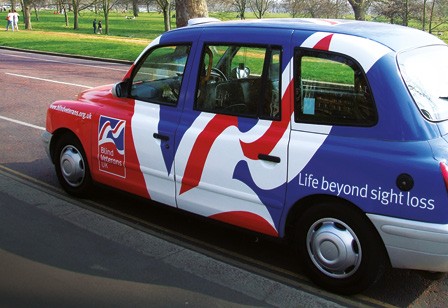
When St Dunstan’s became Blind Veterans UK, moving from a much loved 90-year-old brand was not a decision taken lightly. They felt driven to tackle the rising numbers of people ‘who had served their country’ and were part of the rapidly rising tide of age related sight loss in the UK. To meet this rising tide, they needed to deepen their appeal and raise more money.
Creating a straight-talking, bold and patriotic brand, Blind Veterans UK carved out their unique space of the military sight-loss charity against the crowded military sector and the giants of the sight loss sector. They broke down an ‘institutional’ feel by bringing the stories of veterans to the fore and focused on a can-do attitude delivering a ‘life beyond sight loss.’

Dr. Hadwen Trust, on the other hand, was doing well, what spurred them to rebrand was finding themselves in this second state of re-branding – they wanted to go further.
To change how medical research is carried out, Dr. Hadwen Trust realised they needed to ramp up their game. They calculated they needed £10m a year to make a real difference and decided that a new brand would help them raise more money, mostly from people interested in animal welfare.
But a new brand couldn’t just represent animal lovers. The charity needed a brand as comfortable walking through the gates of a vegan festival as striding through the glass doors of a world-class research institute.
It took a joint effort with all stakeholders to join the dots and distill Dr. Hadwen Trust’s restless energy into a new brand positioning. The Trust’s expertise and experience were drawn on and a co-creative workshop to define what the charity should represent in the future was established.
The new positioning is about compassion for animals and commitment to medical research: advancing human health while ending the use of animals. The charity’s twinned beliefs are now enshrined at the very centre of what the charity stands for.
With new messages behind it, the charity felt its name was holding it back. The old name, ‘Dr. Hadwen Trust’, had a great story but wasn’t clear enough when reaching out to new people.
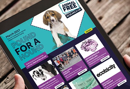
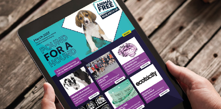
Testing with their audiences uncovered the fact that descriptive names worked better, and Animal Free Research UK leapt ahead of the pack.
‘Animal Free’ lights up the eyes of animal rights supporters, while the strong connection to research wins over the hearts and minds of research scientists. A win-win situation.
Animal Free Research UK’s new, campaigning visual identity brings all this work to life.
The liberation of animals at the heart of the brand amplifies the new name and positioning. It cements the charity’s role in promoting the power of science and technology to replace animals in medical research.
And, the logo changes the label. It breaks free of old thinking and shows the charity taking pride in their goal of medical research without animals. It’s a label to rally behind for supporters, and a badge of pride for scientists committed to research without the use of animals.
Theirs is the perfect example of a rebrand that clearly defined their need to go deeper rather than wider, and the results speak for themselves.