
Brands
British Lung Foundation
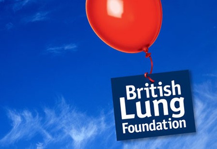
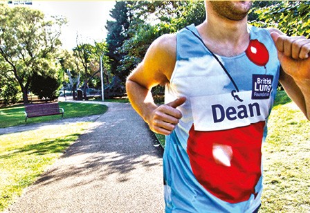
We reinvented the 26 year old balloon icon, as a symbol of support, hope and celebration. The result is an energised, flexible identity that adapts for all the charity’s activities.


What was keeping them
awake at night?
Low national awareness was hampering the charity’s ability to reach out to the millions of people in need of support or advice. They needed to be able to raise more money to extend their vital support services. Our review of the brand revealed confusion with a well-known heart charity and an identity in need of a refresh.
How we helped
Our collaborative process gave the charity confidence to articulate its claim to be the UK’s lung charity. With insight from beneficiaries and supporter groups, we helped them define themselves as the supportive expert. We reinvented the 26 year old balloon icon, as a symbol of support and a celebration of hope. The decision to move to a bolder statement of purpose is reflected in the more modern, flexible identity that adapts to all the charity’s activities.
Our new brand has allowed us to engage with even more people who need our support and...crucially, helped us increase our voluntary income.
—
Charlotte Guiver, Director of Fundraising and Marketing